When beginning an illustration project, I usually start with a prompt of some sort. For this process, I’ll use my work with the well known nursery rhyme “Jack Be Nimble”. This project began as a exercise at an illustrator’s intensive with Kristen Nobles, art director at Candlewick Press, but I won’t go into that (if you get the chance, take her class!). Instead, I’ll share with you the steps in how I create my illustrations.
Time lapse animation of my process.
SKETCHES
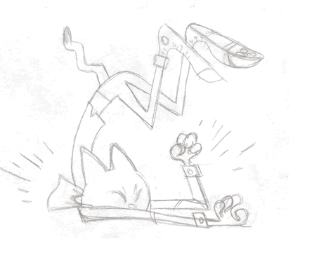
All of my illustrations start out in my sketchbook as quick drawings. Staying loose with the sketches gets the creative juices going and helps me explore the possibilities. I’m not out to create beautiful drawings, but to stay flexible and limber, and get into a groove. Sometimes I look at reference photos or look at my favorite illustrator’s work for inspiration. Anything to get the momentum started. More often than not, researching images can give me an idea of what to avoid when I find repetitive imagery, and I use that knowledge to create something different. I don’t get hung up on creating a masterpiece, but try to add a new twist to a tired idea.
Drawing on paper is the best way for me to work out my ideas and keep a tactile connection with my creation. I’m analog first, digital second. It allows me to get messy with the process and physical with abstract thoughts to bring it out into the real world.

Rough sketches.
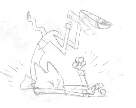
Final sketch
COLOR
Color is a complex beast and there are many theories. There are more color wheels than the one I grew up with in art class! I always define my colors before I start painting my illustrations, especially when painting digitally. It’s easy to spin my wheels with the millions of available colors in Photoshop, or any other digital drawing tools. Planning the color palette before painting will save me time and give the colors a purpose.
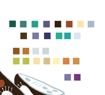
Swatches
I approach digital painting as I would with gouache or watercolor. I’ll have a vague idea of what I want the colors to be. However, I always check with a color wheel with my colors in mind, and seeing it in front of me either validates my color intuition or not. I recommend Paletton, as I can apply different color theories and save out the palette as Photoshop files.
For more on color theory, James Gurney’s blog is a great place to start.
My sense of color came from practice and study. I love reading about color and learning how other people approach it.
PHOTOSHOP
Adobe Photoshop is my digital canvas, although I do work with Illustrator from time to time. Before I start painting, I replace the default color palette with my new one. Clearing the default palette declutters my digital workspace and focuses my attention on my colors. I don’t want the distraction of other colors.
I start a new document with the correct dimensions for the project. I usually work at 100% size, CMYK color space, and save it as a 300 DPI PSD file to keep the layers intact. I open the scan of my sketch and copy it in the new document, then move it to the uppermost layer and set it to “Multiply”. I then set the opacity to 20% and lock it down. I work with my colors below it and toggle the visibility of the sketch to check my progress.
I start blocking in the colors with the pen tool, keeping it flat and working with the shapes in the sketch. The pen tool makes it easy to adjust shapes as you go along. Sometimes this is where I make adjustments to my sketch as I spot tangents, problematic areas, and so forth. Same with the colors. I keep the shapes in its own layer for easy editing.

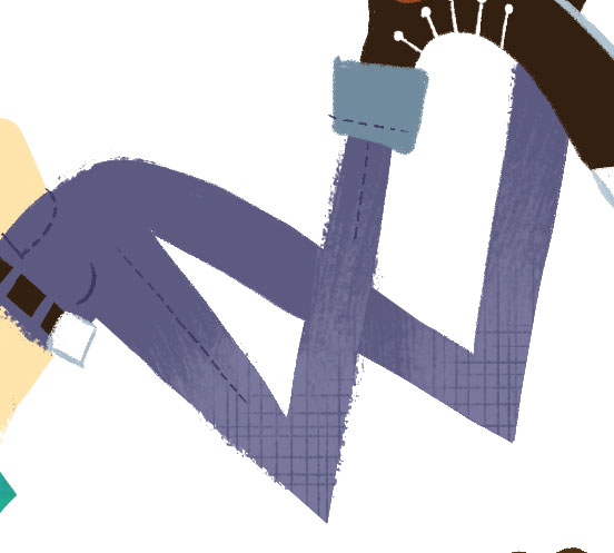
Color flats

Flats details
Once the color flats are done, I rasterize the layers so I can paint directly on them with my brushes. I’ll roughen the edges of the flat colors with my brushes using the same colors to give it an organic feel. Color outside the lines!
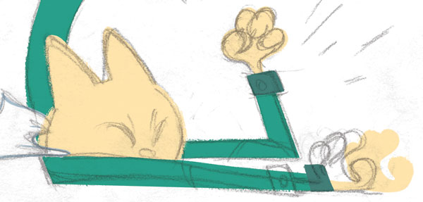
Detail of painted flats. Note the edges.
DETAILS
This is where the illustration starts coming to life. When finished with the flats, I start using other colors in my palette to build up the nuances in the painting. Inspired by an old French stencil method called “pochoir“, I create a new layer and make a selection with the color layer I’m working with. The new selection is my “stencil” and I use it to add my new colors to paint my textures and details.
Adding details
Close-up of details.
I also start painting in the fine details such as lines, textures in the fabric, buttons, and etc. I approach the illustration as if I were painting with gouache, adding and subtracting pixels. It helps me to have had experience painting with gouache, as it can inform my work in the digital space. Gouache is a opaque medium and I build up my colors like a paint-by-the-numbers kit. I approach my digital illustrations in a similar fashion.
BRUSHES
I won’t delve too deep about Photoshop brushes, as it can get highly technical. That’s another blog post!
However, I make my own brushes to make my work unique. All of my brushes start out as marks on paper and then are created in Photoshop. With fine tweaking, I “program” the brushes to make happy accidents, such as a random stray mark to give it a human touch. My brushes already have textures built into them so I rarely scan textures wholesale and place them into my illustrations. I try to emulate the strokes a real brush would make in my custom brushes.
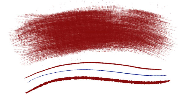
Custom brush examples.
I also work with brushes created by others, especially Kyle T. Webster. His brushes are wonderful. I mainly use his gouache set since it compliments my own brushes. I mix and match my brushes accordingly.
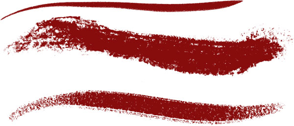
Examples of Kyle’s brushes I utilized for this project.
REFINING
When I am at the finished stage, I scour the illustration for things I may have missed, adjusting colors, adding details, and so forth. However, I need to also know when it’s DONE and not keep messing with it, so I keep track of the time spent on it. I try not to overwork an illustration. (For time management, the Pomodoro technique is excellent.)
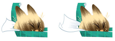
Example of a revision as I paint.
That’s it! I flatten the illustration and save it as a new file, usually a 300 DPI TIFF file.
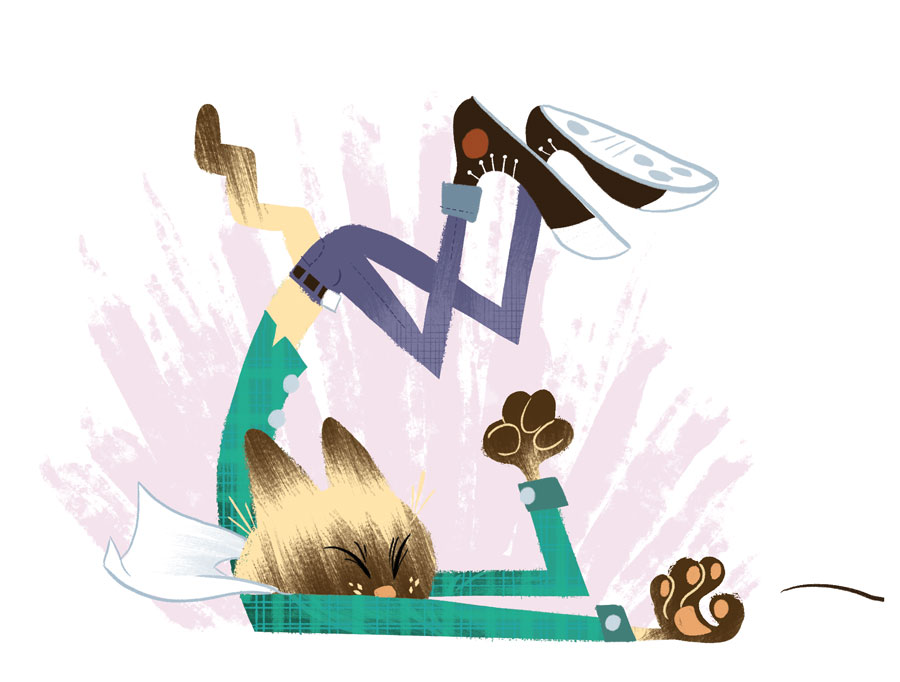
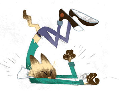
Final illustration. Click to see a larger version.
A note about the pose – logically, it doesn’t make sense. However, illustration is about illusion and pushing reality requires knowing what rules to break so it’s believable. Pushing the poses makes the characters dynamic and just fun to look at.
FINAL THOUGHTS
There you have it! I hope you enjoyed this blog, as I have in sharing my process and thoughts with you. Below is the final piece with the other illustrations rounding out the nursery rhyme. Thanks for stopping by!
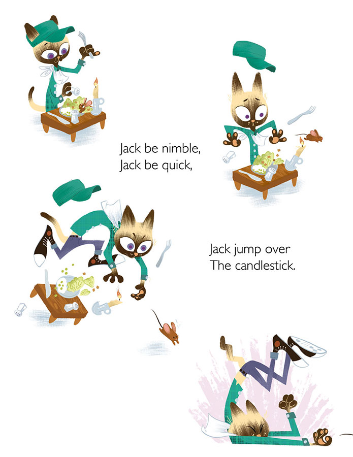
Final illustrations for Jack be Nimble.
BONUS MATERIAL! AD INFINITUM! Below are a few revisions I made at an earlier stage. The colors were tweaked and several objects revised.
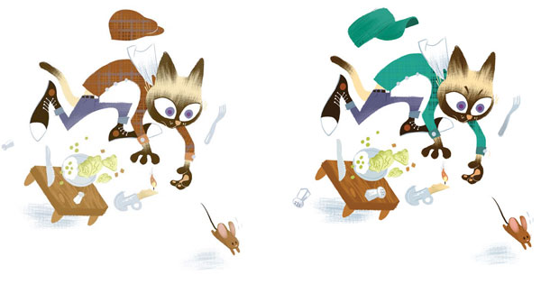
l – first round; r – final art.
Fabulous post, Dalton. So great to see your working process and the rigor of your steps to beauty.
Thanks Tina!
I enjoyed the examples of your custom “brushes,” as well as Kyle’s gouache set! This is what i am striving to achieve with just actual brushes and paint, a rough, loose image that shows the human hand’s movement! Thank you, Dalton!