Uncivilized Books recently commissioned me to design and build a font for French cartoonist Joann Sfar. They are bringing unpublished Sfar material to the North American market and would have to be translated from French. A font of his hand lettering facilitates translation and editing while keeping the unique hand lettered look of his comics. Creating typefaces for cartoonists is one of my favorite thing to do with regard to font making.
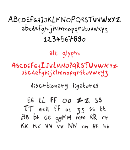
Opentype is a great font format to use for typefaces that have a hand lettered look. People may not see it this way but fonts are essentially small programs that you install on your computer. There are small bits of code embedded into fonts that “talk” with your applications, and dictates how the font behaves. For example, in this font I used discretionary ligatures (see sample above) for certain letters that repeat next to each other such as “ll”, “oo”, etc. When the letters appear as you type, the font automatically switches them out to pairs that I created in the font to keep the organic look of the lettering. There also other options that I embedded into the typeface that will allow the use of alternative letters, basically a second alphabet, to further give the font an organic look. With Opentype, the possibilities are endless.
I was also approached to created a second set of fonts that uses Sfar’s cursive hand lettering. It was decided that it would be too time consuming for the time frame they had in mind, as it involves a different level of complexity and coding compared to the font I built. They ended up hiring a letterer (cartoonist Kevin Cannon) to translate the text and forgo the font. It was the best way to go, in my opinion, as some hand lettering do not translate as well to becoming a font. I saw the results of the lettering and they looked great. (It would have made for a beautiful typeface, though!)
Below is a comparison of the original hand lettering and the font. Do you know which is which?
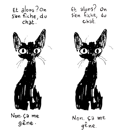
© Joann Sfar
 The Kalm Down logo is for a drink made from