The latest identity project here at the studio is Witness, a new bar located in the heart of Broadway in the Capitol Hill neighborhood of Seattle. It was the dream of bartender Gregg Holcomb to open a Southern church-styled bar that is a place for all to gather. With 102 year old church pew seats and glass windows evoking a church, I was contacted to craft a logo that would give the bar a timeless feel of Southern hospitality. Obvious cliches of church themed typefaces and logos (including Bible aesthetics) were pushed aside in search of something deeper within the zeitgeist of the deep South, and explore the idea of community that involves Sundays after church with potlucks and fellowship.
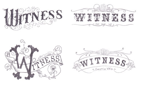
The first round of sketches were inspired by the idea of the church windows being installed at the bar, and rays of light for inspiration. Some of the lettering is a nod to mid century type and revival tent signs from the 40s and 50s.
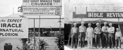
Found via Google Images and various websites. Unfortunately, I don’t know who/where these pictures are from.
Below are the first round of logo ideas inspired by rays of light and tent revivals. Revivals have a sense of community, but it wasn’t quite what we were looking for. It was too churchy.

Use of rays to evoke inspiration and light. Luckily we didn’t use the one on the right, since the “church” windows used in the bar are now rectangular. Back to the drawing board.
One day as I was perusing thrift stores for inspiration, I came across a vintage hymnal book and had an eureka moment. This book represents the very act of fellowship – song! People singing in unison (except in this case it would be drinking and eating) and being in a place of warmth and belonging. From there I researched vintage and Victorian hymnal books for visual inspiration – typefaces, layout, and colors. The point isn’t to emulate the look of the books but to understand the mood of the era, and why/how the pieces recall the feeling that we are looking for to represent the bar as a gathering place.
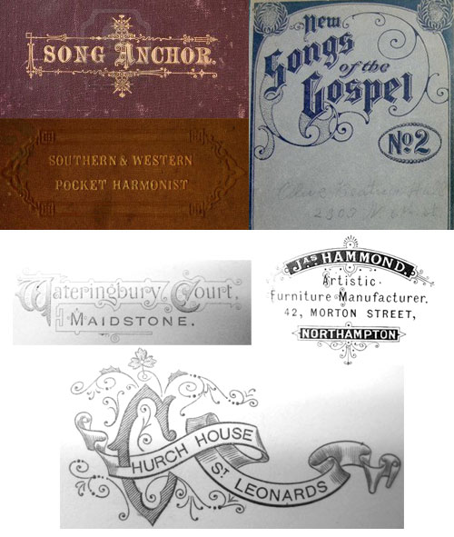
(top) Samples of hymnal books. (bottom) Photos I took from a book of dies printed in the 19th century.
I have a modest collection of vintage type books and most of the alphabets aren’t available digitally. I don’t use out of the box fonts (that is, digitally available) to create my logos. I find an underused typeface that fits what I am looking for and refine the letters to fit my purpose. I scan the alphabet and redraw the letter by hand to give it my touch and improvements. I take it further into Illustrator and tweak the small details that make it pop. (One such typeface wasn’t used in the final logo, but I’m creating a font from scratch based on my findings – saving that for another post!). Choosing the right typeface for a logo is very important, as type can be charged with history, atmosphere, and eras. Look at black-letter typefaces – does it evoke religiosity, gang tattoos, or Nazism? I discovered one of the typefaces that would exemplify the logo and realized that I have the complete alphabet in a book of letter forms I own. The great thing about finding old books is that they usually have long forgotten fine typefaces (either in a book about type or just some printed material using the faces) not available in digital form.
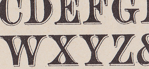
Dig the ink bleed in the cheap porous paper made by metal type.
Now we are getting somewhere.
Later sketches of the logo after I had the “Eureka!” moment.
Not only was I searching for the right typeface for the logo, but also for the menus. Many of the fonts available were too cliched/overused for my taste when it came down to Victorian type. I needed something that would evoke the late and early nineteenth century but doesn’t shout “VICTORIAN!”. I had found the perfect font for the menus in the hymnal book I found at the thrift store and realized I also had this alphabet in a vintage book. Pressed for time, I scanned and cleaned up the font, but left it distressed enough to give the menus a classic feel. The type reference book was printed on cheap thick paper which showed the ink bleed from the metal type, and that alone modified the look of the alphabet when compared to a cleaner version I later found.
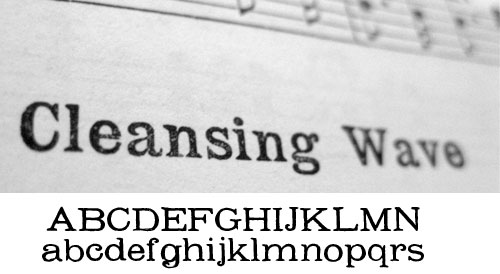
(top) Original typeface from hymnal book and (below) font created.
Not the exact font, but close enough.
Since the main use of the logo would be a painted window sign, gold and a stately slate blue grey would stand out from a shiny reflective window. Gold stamping was found on the covers of hymnal books, giving it a lightness that recalls holy light. More subtly, it also evokes saloons, and all the connotations that goes with it. The idea of inspirational rays of light were retained, and scroll-work reminiscent of Victorian flourishes gave WITNESS an opulent feel. The logo was painted onto the window by local sign painter Sean Barton the old fashioned way with gold leafing and a steady hand.
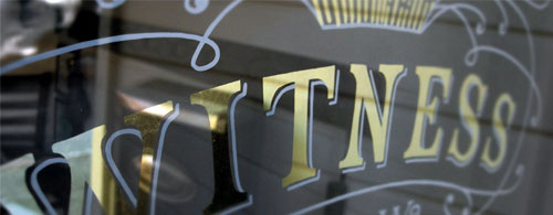
Detail of logo on window.
Visit my Witness project page here for more info, and visit Witness for some delicious soul food and drinks. Don’t take my word for it!