Posts Categorized: Comics

Henry & Glenn Forever and Ever

Check out THE art show of the year in LA this Friday (October 3rd) at the La Luz De Jesus Gallery! Based on the comic book parodies of Henry Rollins and Glenn Danzig (by Tom Neely, Scot Nobles and Igloo Tornado) – Henry & Glenn Forever and Ever – the gallery will showcase great work by a variety of artists, including yours truly. Go check it out! I will also have giclée prints available at the show.

A Little Black Grimoire

A Little Black Grimoire

Joann Sfar Typeface

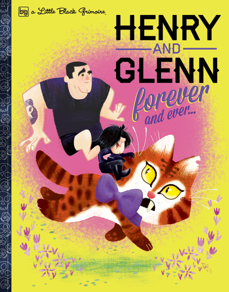
Uncivilized Books recently commissioned me to design and build a font for French cartoonist Joann Sfar. They are bringing unpublished Sfar material to the North American market and would have to be translated from French. A font of his hand lettering facilitates translation and editing while keeping the unique hand lettered look of his comics. Creating typefaces for cartoonists is one of my favorite thing to do with regard to font making.

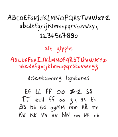
Opentype is a great font format to use for typefaces that have a hand lettered look. People may not see it this way but fonts are essentially small programs that you install on your computer. There are small bits of code embedded into fonts that “talk” with your applications, and dictates how the font behaves. For example, in this font I used discretionary ligatures (see sample above) for certain letters that repeat next to each other such as “ll”, “oo”, etc. When the letters appear as you type, the font automatically switches them out to pairs that I created in the font to keep the organic look of the lettering. There also other options that I embedded into the typeface that will allow the use of alternative letters, basically a second alphabet, to further give the font an organic look. With Opentype, the possibilities are endless.

I was also approached to created a second set of fonts that uses Sfar’s cursive hand lettering. It was decided that it would be too time consuming for the time frame they had in mind, as it involves a  different level of complexity and coding compared to the font I built. They ended up hiring a letterer (cartoonist Kevin Cannon) to translate the text and forgo the font. It was the best way to go, in my opinion, as some hand lettering do not translate as well to becoming a font. I saw the results of the lettering and they looked great. (It would have made for a beautiful typeface, though!)

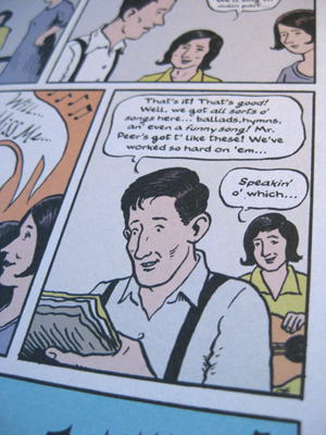
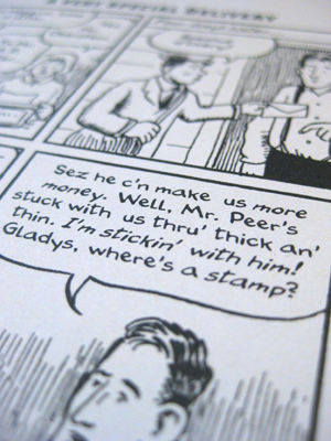
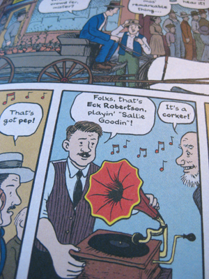
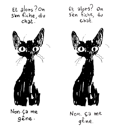
Below is a comparison of the original hand lettering and the font. Do you know which is which?

© Joann Sfar

Typeface design

Besides being an illustrator, I also design typefaces. I have had the honor to work with David Lasky to create and design a typeface out of his hand lettering for his new graphic novel, The Carter Family: Don’t Forget This Song (written by Frank Young). Two different alphabets were created to give the lettering an organic feel, as well as italics and bold faces.  What a great project to work on! Check it out, it’s a wonderful book.

Cereal Comics

Cereal ads in old comics are quite fun to read, as they reflect their TV counterparts on Saturday mornings (do they still have Saturday morning cartoons anymore?). I found these three in an old The Flinstones with Pebbles Gold Key comic (#22, 1964). My favorite is the Lucky Charms ad, but look how boring the box is! (Speaking of cereal boxes, check out these Jay Ward inspired designs.) I don’t know who drew these comics, but I’m researching who the cartoonists are. Man, I would so love to have that job drawing cereal ads.

That one kid in the Lucky Charms ad looks suspiciously like a chipmunk.

click to embiggen

click to embiggen

click to embiggen

Ephemera Collection – Al Wiseman

Sometimes I like to hit thrift stores or antiques shops  to hunt down ephemeral paper documents such as brochures, advertisements, booklets, etc. with great illustrations. These small objects weren’t meant to be permanent and were often thrown away so it’s always a joy to discover a long lost illustrated piece of paper by an unknown, or sometimes known, cartoonist. I have a small collection that I will be scanning and sharing with you.
Recently, I found a single sheet with a beautiful Al Wiseman illustration for Boeing. Al Wiseman was a ghost artist for the Dennis the Menace comic books from the 50s and 60s, and this drawing seems to come from that time when he was ghosting the Dennis comics, possibly late 60s to early 70s (the 747 was produced in 1969).  The illustration has a fluid line, with a crunchy texture in the clothes and beard, and it’s almost calligraphy. I’m guessing it is a part of a sales package or advertising campaign created for Boeing, so I will be keeping an eye out for anything else drawn by Wiseman for this campaign. If you have any leads or info about this drawing, I’ll love to hear from you!

click to embiggen

2t Blokes

“2t Blokes” is a comic strip I created for scooter riders and fans. 2t refers to “two stroke”, the type of engine the older Vespas have – so the title would read 2 Stroke Blokes (scooter enthusiasts would be in the know). Enjoy!

click to embiggen

2t Blokes © 2010 Dalton Webb. All rights reserved.