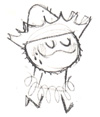
 The Kalm Down logo is for a drink made from kava, drunk in Polynesian culture (especially within the island of Fiji) for hundreds, if not thousands of years, for it’s relaxing qualities. My client, Kalm Down, LLC., have been in business within the year, but felt that they needed to revamp and develop their brand to stand out among many of the mediocre kava makers in the market. They drink and believe in their kava. After hearing their story, kava came across as an experience, a ritual if you will, very similiar to that of tea. “Anti-Red Bull” and “calming down after a busy day” were the key things we talked about. I took my notes and did some research on kava to glean more information. I looked for verbs that described kava, such as “calming”, as well anything that will describe an experience. Verbs are dynamic, taking passive images such as a logo into action. I always research and inform myself of the product before I start any thumbnails. Who is the customer? Who do they want their customer to be? How do they want to present themselves? Is it an experience? etc…
Looking at the competing brands, I’ve noticed that they used images of the kava plant, usually the leaves. I decided to stay away from using the plant as a logo, since the leaves are never used in the making of kava (only the roots are used since the leaves are poisonous), and the leaves looked generic. I focused on the feeling kava gave the drinker and as well as the ritual. One of the rituals is that a young woman would prepare the kava and present it to the drinker in a coconut cup.
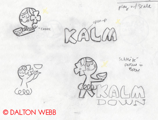
A touch of Polynesian kitsch was used to lightened the logo. Here are the preliminary logo sketches (a few among many).
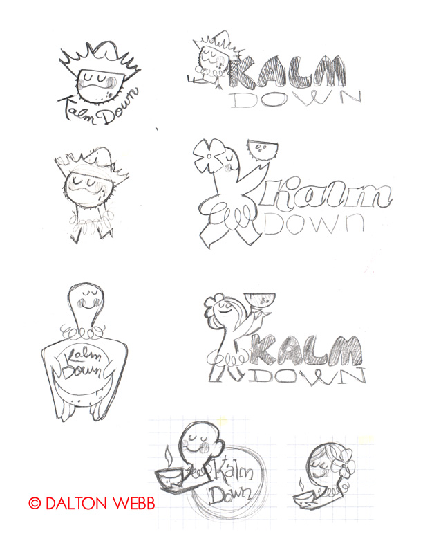
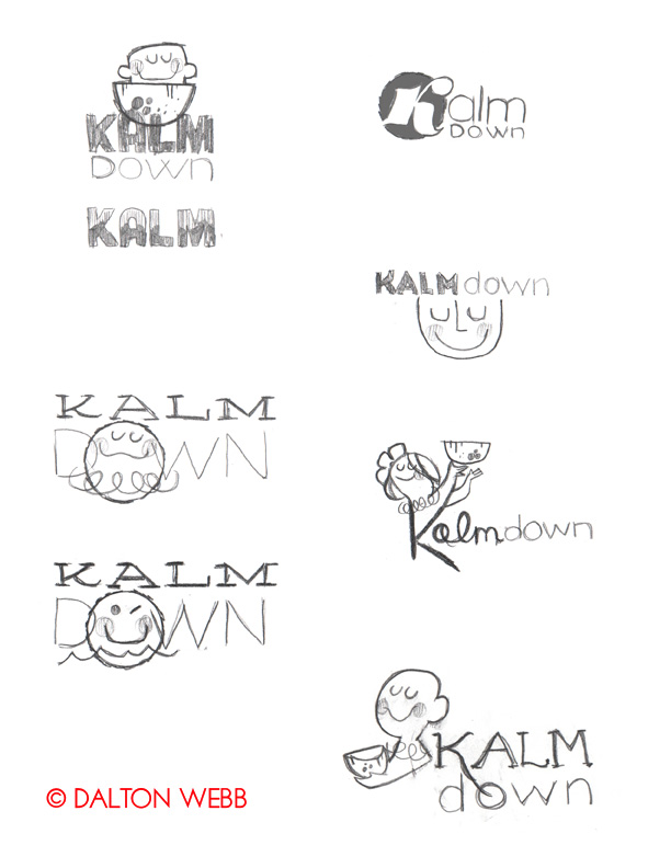
We decided to go with the idea of the woman presenting the drink, an age old ritual. See how the shape of the woman’s body reflects the shape of the letter “K”? (As a side note, I really like the coconut head guy. Might save that for later use!)
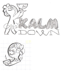
I combined the lady at the top with the drawing at the bottom. Here is what I came up with:
I wanted the “Kalm” to be handlettered, as it will be unique to the client’s brand. I scoured type specimen books and this popped out at me:
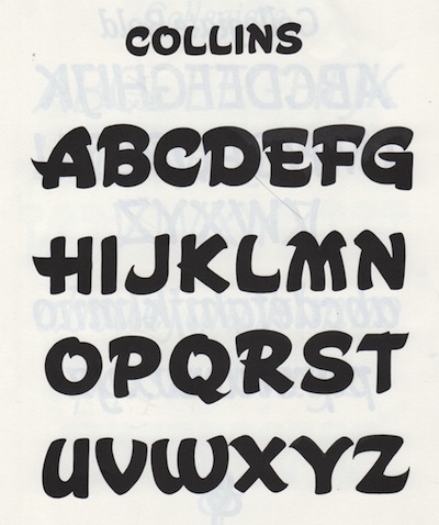
Not quite perfect, but it can be improved. It has a touch of the “tropical” I am looking for without hitting you over the head.
Some examples of other handlettered sketches:
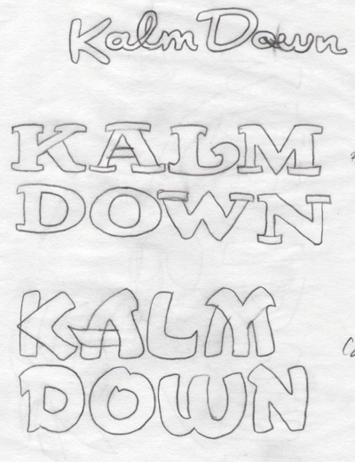
More refinement… I simplified the letterforms and took out the extraneous bits in the “A” and “M”. I modified the glyphs even more once I was working in Illustrator.

To make a long story short, here are a few early logos drawn in illustrator:
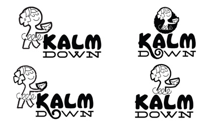
I tried different line qualities in the woman, and at this point, I decided to add a loop coming from the “K” downward to the “O”, to tie together the type (also a subtle nod to roots). I always start off with black and white, adding color later. Getting the logo down is much more important in b/w, for simplicity’s sake. When working with color, I throw out the default color palette and start from scratch with my own colors.
Color and font treatments examples:
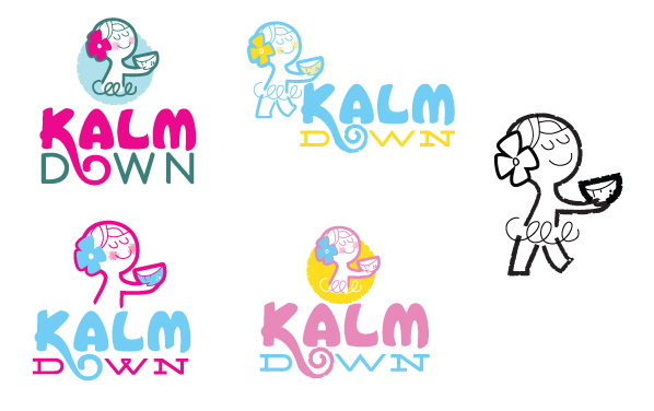
We decided to simplify the woman, got rid of the torso and the skirt. I also took out the coconut that was framing her. Every once in awhile I find it best to throw in a lot of stuff at first so that way you can start paring down the inessential elements and keep the ones that work.
After several revisions, we went with a calmer color scheme, green and brown. It evoked a natural, calm feel and the green reflects the sea-foam green of the ocean. The “Down” typeface was modified from an existing font family. I shortened the serif brackets and modified the loop in the “W”. “Kalm” was also tweaked further.
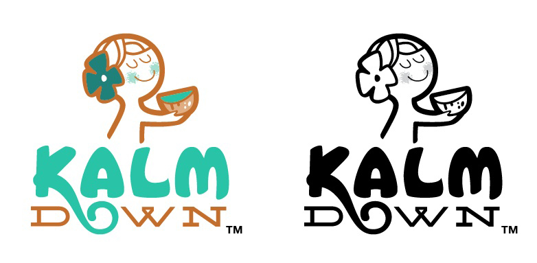
The final logo. A redesigned package and website will be coming soon!
Aren’t you ready for a cup of kava and chilling out in a hammock?
“Kalm Down” is © Kalm Down, LLC.

Excellent stuuuuff!! 🙂
Thanks!