Newest promo card! Getting ready for a new round of mailings and the upcoming SCBWI children’s book conference.
front
Newest promo card! Getting ready for a new round of mailings and the upcoming SCBWI children’s book conference.
front
Uncivilized Books recently commissioned me to design and build a font for French cartoonist Joann Sfar. They are bringing unpublished Sfar material to the North American market and would have to be translated from French. A font of his hand lettering facilitates translation and editing while keeping the unique hand lettered look of his comics. Creating typefaces for cartoonists is one of my favorite thing to do with regard to font making.
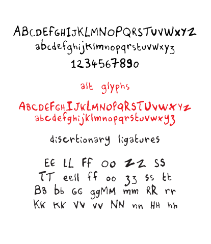
Opentype is a great font format to use for typefaces that have a hand lettered look. People may not see it this way but fonts are essentially small programs that you install on your computer. There are small bits of code embedded into fonts that “talk” with your applications, and dictates how the font behaves. For example, in this font I used discretionary ligatures (see sample above) for certain letters that repeat next to each other such as “ll”, “oo”, etc. When the letters appear as you type, the font automatically switches them out to pairs that I created in the font to keep the organic look of the lettering. There also other options that I embedded into the typeface that will allow the use of alternative letters, basically a second alphabet, to further give the font an organic look. With Opentype, the possibilities are endless.
I was also approached to created a second set of fonts that uses Sfar’s cursive hand lettering. It was decided that it would be too time consuming for the time frame they had in mind, as it involves a different level of complexity and coding compared to the font I built. They ended up hiring a letterer (cartoonist Kevin Cannon) to translate the text and forgo the font. It was the best way to go, in my opinion, as some hand lettering do not translate as well to becoming a font. I saw the results of the lettering and they looked great. (It would have made for a beautiful typeface, though!)
Below is a comparison of the original hand lettering and the font. Do you know which is which?
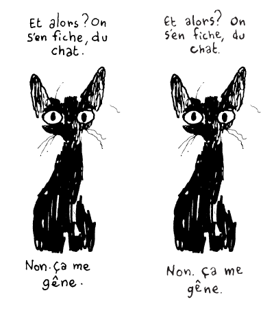
© Joann Sfar
![]()
The latest identity project here at the studio is Witness, a new bar located in the heart of Broadway in the Capitol Hill neighborhood of Seattle. It was the dream of bartender Gregg Holcomb to open a Southern church-styled bar that is a place for all to gather. With 102 year old church pew seats and glass windows evoking a church, I was contacted to craft a logo that would give the bar a timeless feel of Southern hospitality. Obvious cliches of church themed typefaces and logos (including Bible aesthetics) were pushed aside in search of something deeper within the zeitgeist of the deep South, and explore the idea of community that involves Sundays after church with potlucks and fellowship.
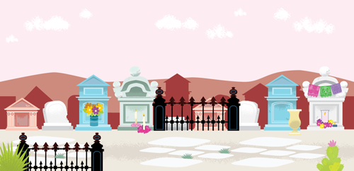
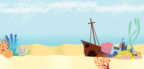
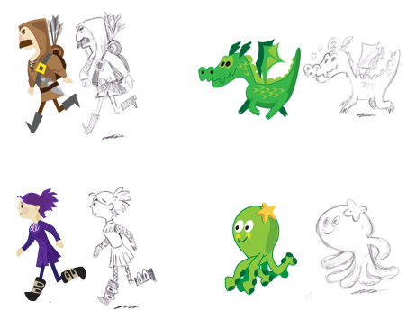
It’s been busy here at my studio this summer! I’ve been working with the wonderful folks at Plexipixel creating game art assets for HTML 5 games, and Woot Studio from the Great White North put together the Platformer Game Starter Kit (scroll down to “Free Game Art” for the art packs) with the art. I created the characters and animations for the following themes – Zombie, Day of the Dead, Fantasy, Gothic, & Underwater (Outer Space & Steam Punk were illustrated by the talented Laura Goldstein). The latest creations are the Backgrounds & Items, where I worked on environmental assets for Day of The Dead, Underwater, Gothic, and Fantasy.
I’ve posted some examples below.
Animations:


Backgrounds:
Characters:
If you are interested in learning and creating HTML 5 games, go download the Platformer Game Starter Kit at Woot Studios. The best part is that it’s FREE!
Many thanks goes to Vickyr Tamaru at Plexipixel for the opportunity to work on this awesome project!
My first children’s magazine illustration! The fine folks at Humpty Dumpty magazine hired me from a postcard I sent out. It’s out now!
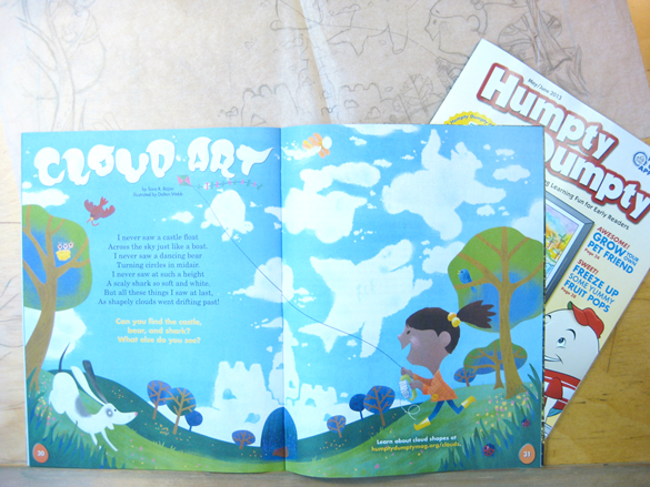
The full illustration:

The Society of Children’s Book Writers and Illustrators (SCBWI) featured my work in their Bulletin magazine for the months of May/June!
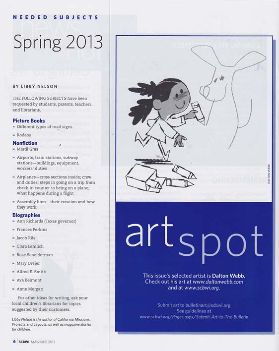

“Legal Beagle”, digital illustration. © 2013 Dalton Webb. All rights reserved.
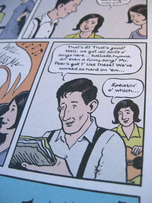
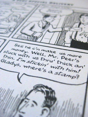
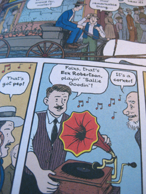
Besides being an illustrator, I also design typefaces. I have had the honor to work with David Lasky to create and design a typeface out of his hand lettering for his new graphic novel, The Carter Family: Don’t Forget This Song (written by Frank Young). Two different alphabets were created to give the lettering an organic feel, as well as italics and bold faces. What a great project to work on! Check it out, it’s a wonderful book.